
A sunlit clinic reception with a patient walking down the corridor

Industries / Healthcare & Medical

People arrive worried.
The site shouldn’t add to it.

A clinic site has one job: get a nervous person to the right door, the right doctor and the right next step, without making them call. We build the calm version.

01Overview

Most clinic sites send patients to the phone.

Patients come in worried, in pain or on someone else’s behalf. They need the right location, the right provider and a clear next step. When the site can’t give them that, the front desk takes the call, and the front desk is already drowning.

  1. 01

    Patients can’t tell which location, provider or service they need, so they phone the front desk.

  2. 02

    Provider pages are a staff directory, not a reason to trust anyone.

  3. 03

    Forms collect health details on pages never built with privacy or accessibility in mind.

  4. 04

    The site fails WCAG checks, and a big part of the audience is older, injured or using a screen reader.

03What we build

Four things every patient touches.

Each one is designed to answer a question before someone has to pick up the phone.

3.1

Service and location finders

Plain-language service pages that route to the right location and provider, with hours, parking and insurance up front.

I need help withKnee pain
Orthopedics · Main campusOpen today until 6 pm
  • Free parking, level 1
  • Accepts most PPO plans
  • Next visit: tomorrow
See providers
Sports medicine · Coast clinicOpen Saturday
  • Street parking
  • Walk-ins welcome
3.2

Provider profiles that read like people

Photo, specialties, languages, booking and the three sentences a patient actually wants.

Provider name, MDFamily medicine · 12 years

“I explain everything twice, once in plain English. Bring your questions; we’ll get through all of them.”

EnglishEspañolNew patients
Book a visit
3.3

Appointment and intake paths

Request flows that collect only what’s needed, over HTTPS, with clear handling notes and no PHI in analytics.

  1. Reason
  2. Time
  3. Details
Tue 9:30Tue 11:00Wed 8:15Wed 2:40

Your privacyWe only ask what we need to book you. Nothing you type here is sent to analytics.

3.4

Accessibility as the default

Real contrast, keyboard paths, labelled forms and readable type, tested on the phones patients actually use.

Aa
7.4 : 1Text contrast · AAA
  • Every field has a visible label
  • Full keyboard path, visible focus
  • Readable at 200% zoom
  • Screen-reader tested
  • Tap targets 44 px or larger
  • No time limits on forms

043D explainer

Understand it before the first visit.

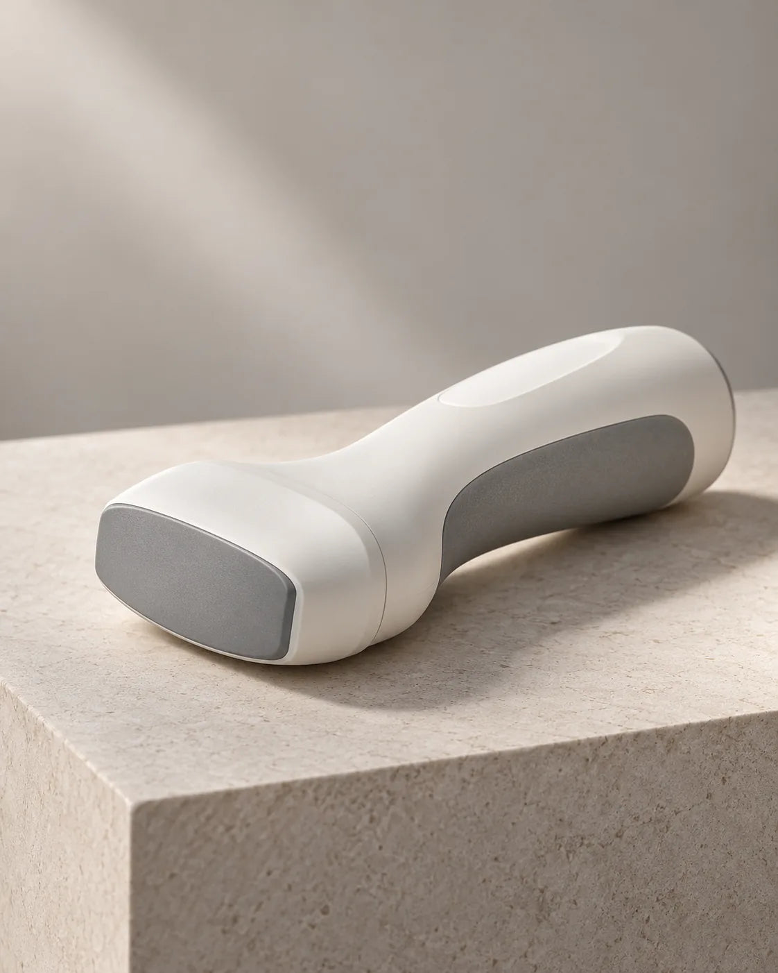
A scroll-driven model of your device or procedure, so patients and referrers know what they’re looking at. Tap a part.

An exploded view of a handheld ultrasound probe
Tap a partFive components, one handheld scanner. Example device.

05What you walk away with

Three ways to start.

  1. 01

    A clinic site with a service-to-provider finder

    Custom build on Shopify or a lightweight stack, with a location directory and booking handoff to your scheduling system.

  2. 02

    A device or treatment explainer in 3D

    A scroll-driven model so patients and referrers understand it before the first appointment.

  3. 03

    A referrer portal

    A password-gated page set for referring physicians, with forms, fax-free document upload and status updates.

Start a project

Tell us what you’re working on.

Start a project